Sticking to News

Aggregate is intended to be used for news or magazine type content. I have only the most hyperlocal of news to communicate, though this item might be of more general interest. It has been cool to see the rise of the new structure which will replace the aging and creaky Kosciuszko Bridge that presently rises near Calvary Cemetery in Queens.
It appears that the new bridge will still be called the Kosciuszko. There is more news about this at the Queens Gazette.
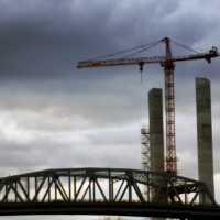
The old bridge appeared in “The Godfather” and in “Urban Cowboy”. Both these films shot scenes in Calvary Cemetery, which is were I was when I took the above photo. It’s a little blurry.
I made a project a few years back of capturing the sound of the old Kosciuszko. The bridge emanates a distinct and unique volley of noise, one which will be gone with the new bridge and likely not missed by those who spend their days in the vicinity of this structure. The noise from this bridge deflects off tombstones in Calvary, creating a pinball-like effect of mercurial sounds disappearing into ephemerality. Sound, I think, is the blood of a society, and of a civilization. I wish we know what biblical times sounded like. I imagine the spreading of news and information carried a grating, raspy hue.
Here is a sample I posted to Radio Aporee, and cross-posted at Sorabji.NYC:
For some reason the above Radio Aporee iframe will not center when I select the object and click the “center” button in the visual editor toolbar. Perhaps iframes are not recognized by the visual editor? I put div tags around it to get it centered.
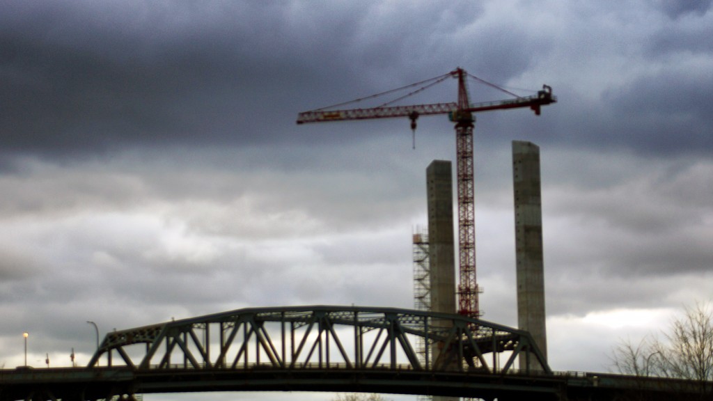
Here is how the new bridge is looking as it starts its rise next to the current hulking roadway:

The New Kosciuszko Bridge
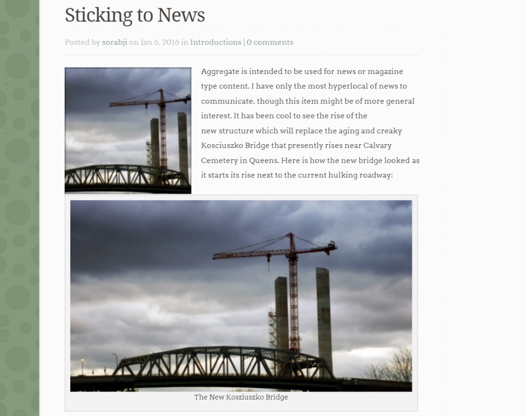
Something I did not realize in the first posting was that the featured image, which must be chosen or else there will be a conspicuous looking blank space on the top page, is also used in a smaller version at the start of the story. Thus if you wish to use the featured image within the story content you could wind up with a clumsy layout such as this, where the image is seen twice on the same screen:

Aggregate. Elegant Themes.
This could be interpreted as an example of design dictating content. To avoid this klutzy looking bumping together of identical images I’ll have to generate a paragraph or two of additional content. I think the thumbnail at the start of the story works as an introduction to the larger image down the page, though the featured image might not always appear within a posting.
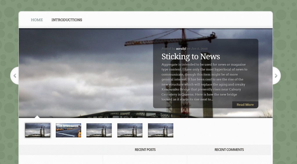
With only two posts on this site the top page looks a little wonky. Obviously this theme assume some significant quantity of content, so that’s OK, but for now our little news site shows 4 thumbnails for the second posted story. The extra three of those thumbnails link to nothing:

Elegant themes: Aggregate
