Aggregate Excerpt Formatting Tweak

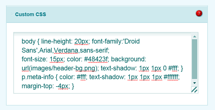
To make the text of the content in the Aggregate theme more readable I increased the font size from 12px to 15px. In WordPress one might typically do this by setting up a child theme but in the interest of expedience I did it using Elegant Themes’ epanel, which lets you override the default CSS.
I find that it is not always obvious what CSS element one needs to tweak to make a desired change but in this case it’s simple:

Aggregate Elegant Theme
The increase in font size necessitates another bit of work. One must create a short excerpt and enable “Use excerpts when defined” on the cpanel. This is because the default excerpt length in WordPress is 55 characters. One can override that 55-character default in a functions.php file using the child theme setup but for sake of elegance (and, again, expedience) I think that manually creating the excerpt is better content.
Automatically created 55-character excerpts end in a drizzle of ellipsis which I find unprofessional.
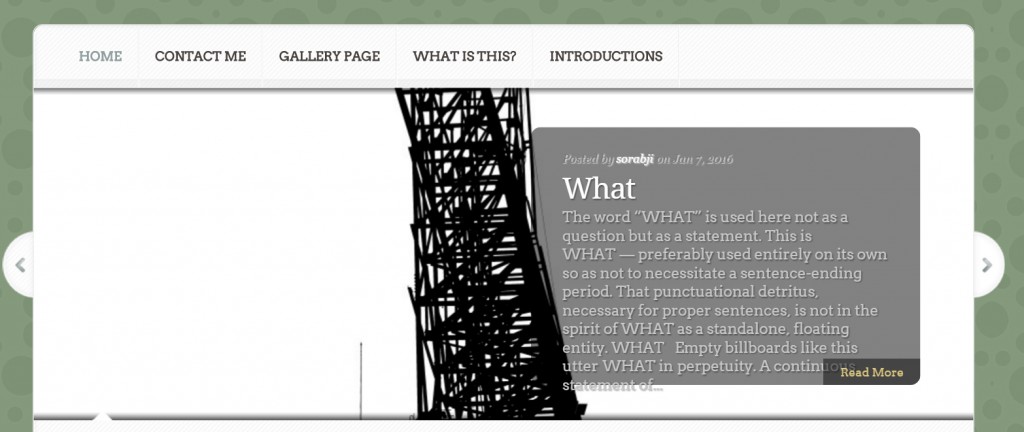
Additionally, in the case of the Aggregate theme I find that increasing the font size for readability causes it to overflow from the space allotted it on the home page:

Aggregate Elegant Theme
Ah, the horizontal line, or HR element. It was considered a joke by web designers when the web was new. I wonder if it still is. Kind of surprised to see it on the default visual editor toolbar for all the ridicule it used to get. It’s not the <blink> tag but it was considered a pretty blunt design element among those I worked with.
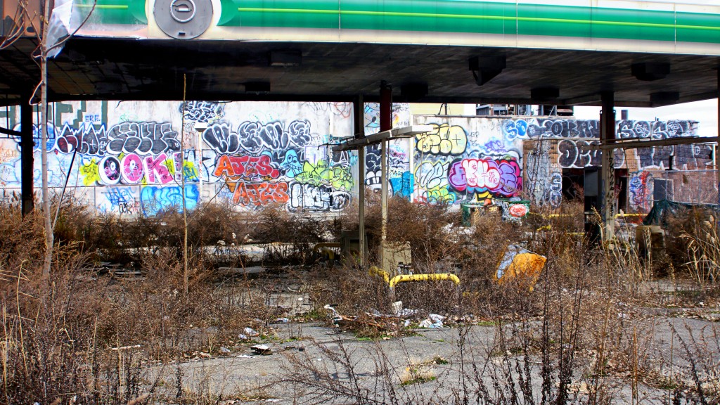
This gas station at Queens Plaza has been abandoned for years. I am surprised the overgrowth of weeds and such is no thicker than it is. I think this was a BP station. I seem to remember buying coffee here once. The wood barricade surrounding this space has been a ripe target for vandals. One day this will be erased to make way, one assumes, for more of the much needed luxury housing that is stomping out Queens Plaza.

Abandoned Gas Station, Queens Plaza.
